bringing our
brand to life
At AFI Branding, our heart and soul go into bringing your brand to life. So, we decided it ought to be our turn to come to life! We wanted our brand and website to be as creative, bold, brave and fun as we are, inspiring curiosity and turning heads along the way. Every element of our new branding has well and truly earned its place, from our bolder look, to our fresh new website - we didn’t end up wild and blue by accident!
This is how it all came together:
first, the colours!
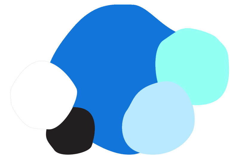
Our vivid blue hero colour was chosen for its incredible and fascinating history. The colour is a brand-new pigment (Yin Min Blue) that Professor Mas Subramanian and Andrew E. Smith discovered accidentally in 2009. We love how the combination of these elements represents the innovation and progressive nature of AFI Branding and our constant push to discover new things.
then, the statues of course.
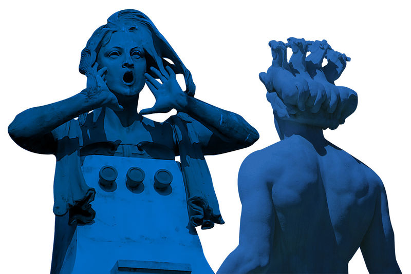
We knew we needed something different, something that would stand out, but would still encompass who we are. So, in come the statues! Statues, like brands, are important. They stand for something. They are created for a reason. But so often they are left to date and weather, just like a brand. By making the statues vivid blue, they immediately lose their age and staleness and take on a whole new feel. They become bold, modern and relevant again. They’re the perfect metaphor for how we look at injecting new life into every brand we encounter.
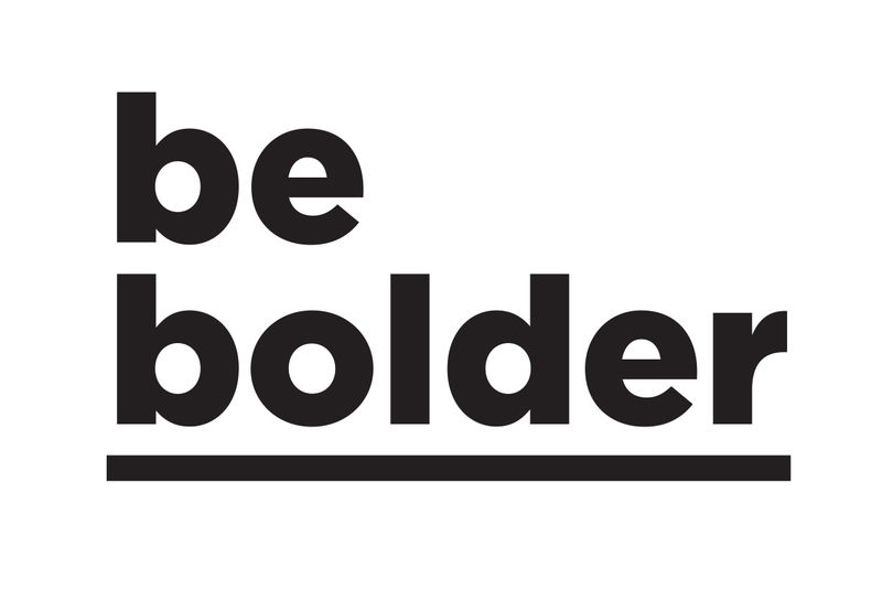
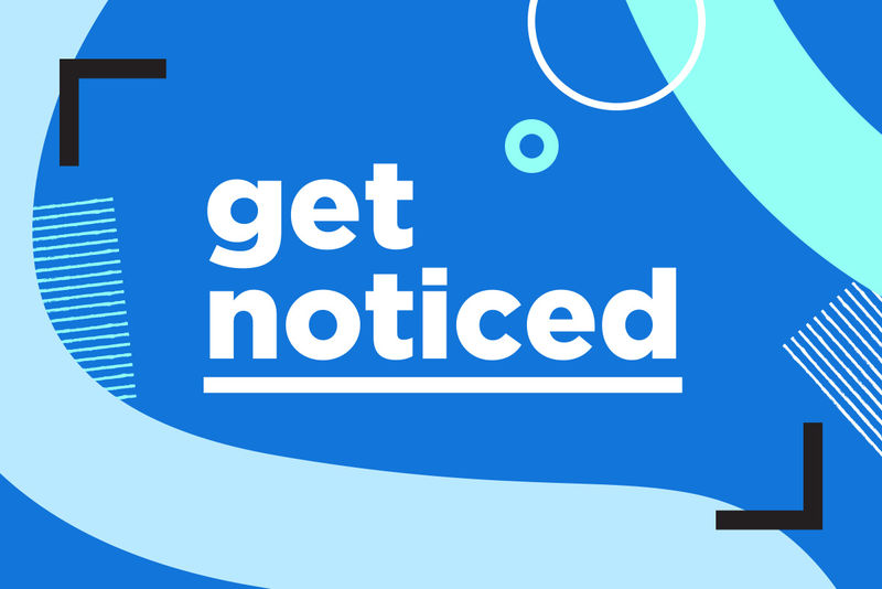
now, some bold words to tie it all together.
The statements of our new brand are big, bold, punchy lettering, that inspires creativity and encourages our clients to stand out and push for bigger, bolder, more exciting and more impactful solutions for their brands. As we say, “be bolder, get noticed!”
can’t forget some big, bold fibres!
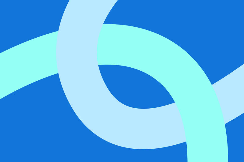
Fabric is in our DNA, so it was obvious that we needed to showcase this element in a big way. It is our focus, point of difference and defines the quality of our products. By using big, bold, wavy lines throughout our branding, a direct link to thread and fibres is clearly portrayed. Fabrics are intertwined through everything at AFI. Plus, they represent connectivity, fluidity and endless possibilities.
details, details, details.
One of our most impressive products is ReFrame®. The innovation and scope of this product is a pillar of what we do. ReFrame® is a bit like a grown-ups version of K’nex™ for your own brand! We’re particularly proud of our ReFrame® product, so much so that we wanted to represent it within our new brand identity. Cue ‘bracket corners’ across and included ‘patchwork squares’ to tie in the fabric component. These elements add another layer of texture to our branding, along with circles to represent the ‘full circle process’ that we strive to deliver to each of our clients.
AFI Branding is a bright, bold and blue brand. We hope you love it as much as we do.
If you want to be bolder and get noticed, contact us today!